Title ideas:
Silent whisperSilent stalker
Dark secrets
The haunting shadow
Whispers in the dark
In the shadows
Sinister Lurker
The night's prey
Dark pursuits
Veil of fear
Silent terror
Lurking shadows
Behind the shadows
Typeface ideas:
This is our title font

Thinker (capcut)


Thinker-RG (capcut)

Relax (capcut)


Ravenly (capcut)


This was done by shannon ⬆️

Merchande-Rgh (capcut)


Sticky (capcut)
 IM FELL (capcut)


(This is made by maxine) ⬆️
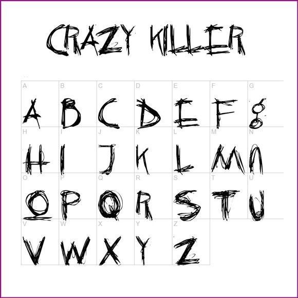
Eventually our group and I decided on this font which combines the fonts of Thinker in cap-cut and the crazy killer font from the pinterest board to create the font for the whole text of the movie except for some modifications from the movie introduction's title sequence that will be discussed further.
Movies that created the inspiration for our font choices

The crime and horror movie Se7en inspired the hand written scratchy look of our fonts.
I liked how it's handwritten which gives it a personal and raw feel connoting the eerieness and mystery of the Se7en's theme. I didn't like how it isn't really as messy or scribbly as what my team and I had planned but it's a good enough foundation / inspiration for our team to start with

this is the final font we choose for the credits its called
Jo wrote a love song regular using the official title "in the shadows"
We eventually choose this font because it's all over the place and messy enough to connote the energetic and anxiety induced thrill of our movie . We choose this style because it conveys the adrenaline and unsettling atmosphere of the whole movie opening. It's as if the killer himself wrote a notes to these teenagers which is exactly the feeling we want our audiences to feel.
Self Reflection:
I think this typeface quite suited for a movie title since it's about murder and horror. I particularly like the "thinker" font in cap cut as well as the ink font from pinterest which reflects blood and the tragedy that would occur which matches with the overall theme of our movie introduction but I'm glad we chose the final font to give the same feel for both the title and the credits.
No comments:
Post a Comment